Yes, I'm back. After coming out to a hot start, I quickly cooled down and quit writing for an extended period of time. I'm sorry!
As long as I can remember, I have been very critical of jerseys, logos, and everything like that. Ok, ok, I'm a little obsessed with them! So, to get us started back up, I'm going to rank the jerseys in the NHL (not of all time or we all know the Northstars would win). This is purely my opinion, and yes I know I am biased *cough*Flyers suck*cough*.
These rankings will be done from worst to first, so here we go:
30. Detroit (just kidding, their jersey's are not that bad, I just hate the wings)
30. Anaheim Ducks

The color scheme is bad, but the main reason these jerseys rank dead last is the atrocious logo. Look at that thing, it is horrible! And just think, they used to use this one:
 29. Columbus Blue Jackets
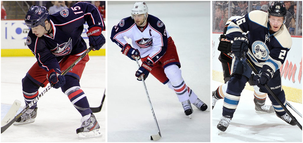
This is another casualty of a bad logo. They almost save it by having that alternate jersey, which has a great logo on it. However, their primary logo is so bad I am penalizing them for it. Seriously, just make the alternate jersey the primary one already!
28. Nashville Predators
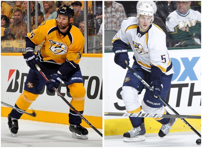
This is a collision of bad color scheme meets bad logo. The yellow jersey's are just bad, however the white ones have promise
27. Florida Panthers
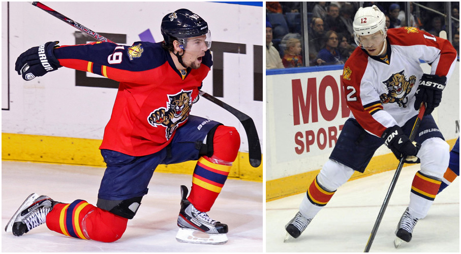
In case you haven't picked up on the theme yet, a bad logo hurts you in these rankings. And ladies and gents, this logo is bad (although their secondary logo is even worse!).
26. Washington Capitals
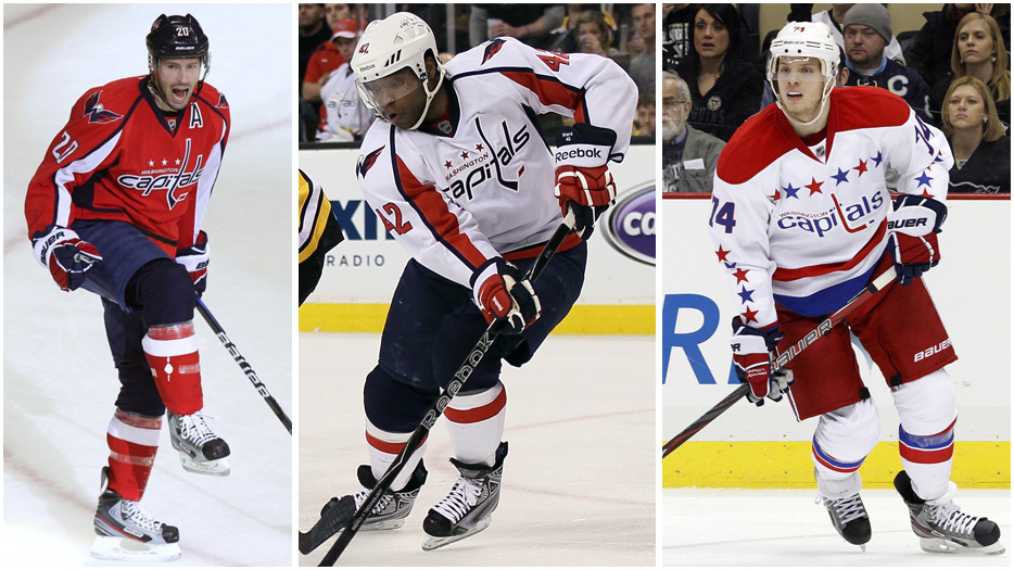
I fully admit this one might be lower due to my bias against the Caps. However, I hate so much about these jerseys. Both logos, the team, and Ovechkin.
25. Colorado Avalanche
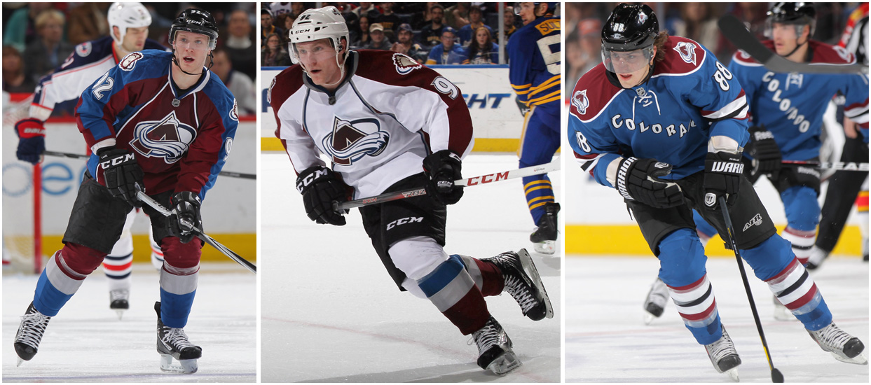
Maroon is an ugly color. Can we all agree to just get rid of it? Their logos do not help their cause. The alternate jersey has promise, but it's not quite there.
24. Ottawa Senators
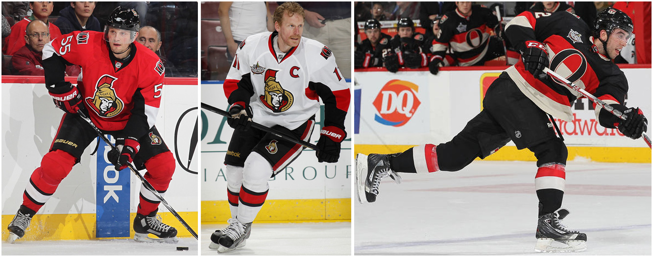
This is where it gets a little tougher. There is a large group of jerseys in the NHL I consider in the "meh" category. This is the first of those. The two primary jerseys are decent, and I have little issue with the logo. My biggest concern here is the horrible alternate jersey. Dear Senators, please never wear those... ever.
23. Winnipeg Jets
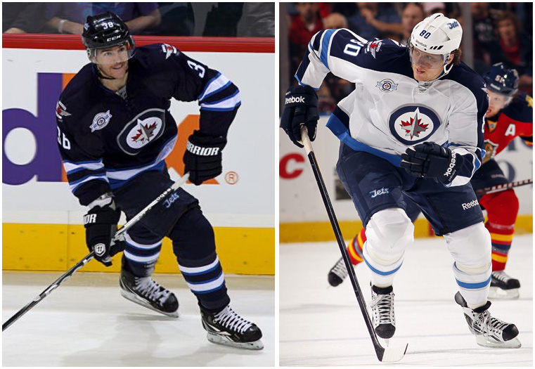
This one has me confused. I love these jerseys, I really do, but that logo bothers me. Mainly because it could have been this:
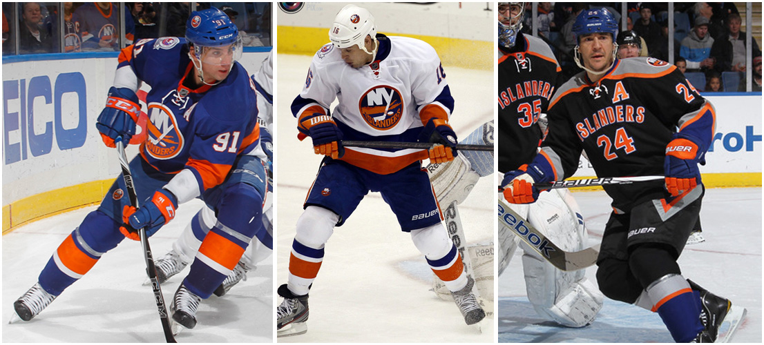
 22. New York Islanders
 21. Edmonton Oilers
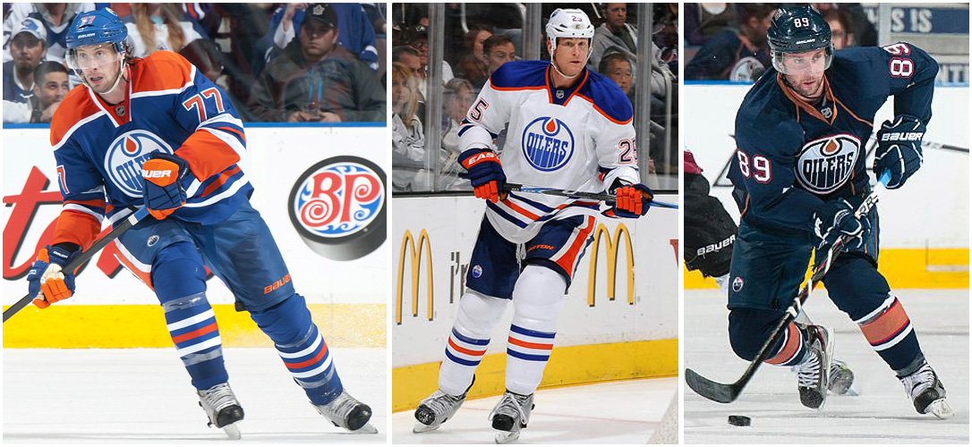
I paired these two together because they are basically the same. They both have horrible color schemes with decent logos. I'm not going to remove orange like I did maroon, but can there at least be an application process? It rarely works out well for anyone. The edge here goes to the Oilers because their alternate jersey is better.
20. Carolina Hurricanes
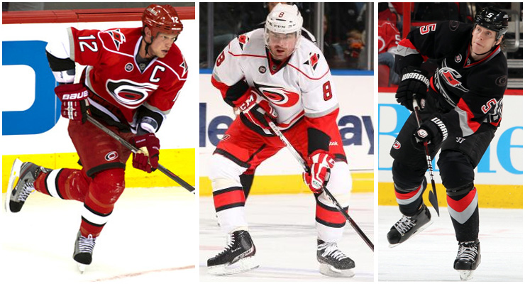
The logo here is the problem. And to solve that problem, they came up with an even worse secondary logo. Not to mention, they are hoarding all the Staal's so I hold some resentment.
19. Phoenix Coyotes
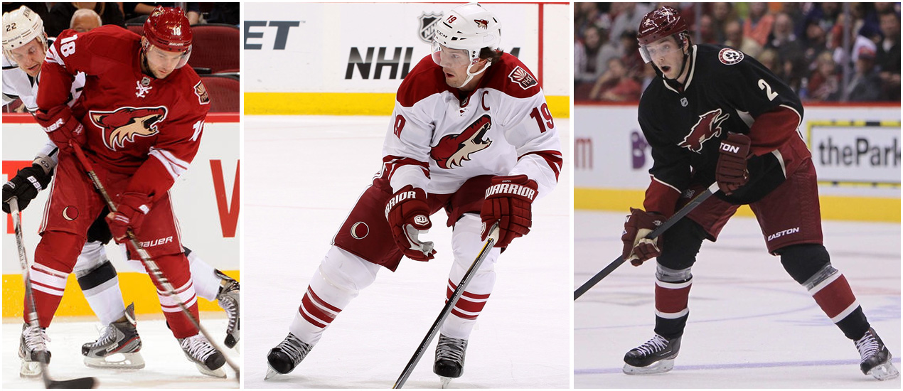
The idea here is getting better than what they used to be. I still don't like the logo, but I don't hate it. However, I do hate their new alternate jersey logo.
18. Minnesota Wild
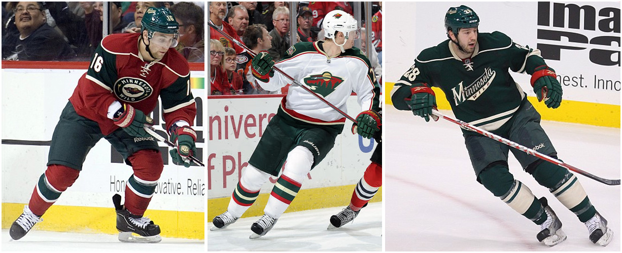
I'm sorry to all my friends from the State of Hockey. I tried to hold off as long as I could. Let's break this one down jersey by jersey. The first jersey is solid. Love the circle logo idea, however that stupid Wild logo is still in the middle. Second jersey is okay at best. Seriously, stop it with that logo. Hire a better graphic designer. Finally, the alternate jersey. If Minnesota doesn't just switch to this next year, they are dumb. Nothing but love for that alternate jersey.
17. Dallas Stars
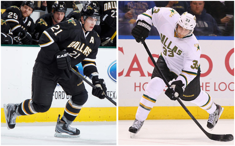
These jerseys are not really that bad, just not that good. The switch away from their primary logo on the front was a great decision. Only problem is they still have that garbage logo. Can they just trade the Stars name to Minnesota??? We all just want this back:
 18. St. Louis Blues
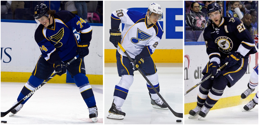
These are pretty decent jerseys. I really do like how they use the yellow. Yellow can be a difficult color to use right (see Nashville for how to use it wrong), and they do it well.
15. Los Angeles Kings
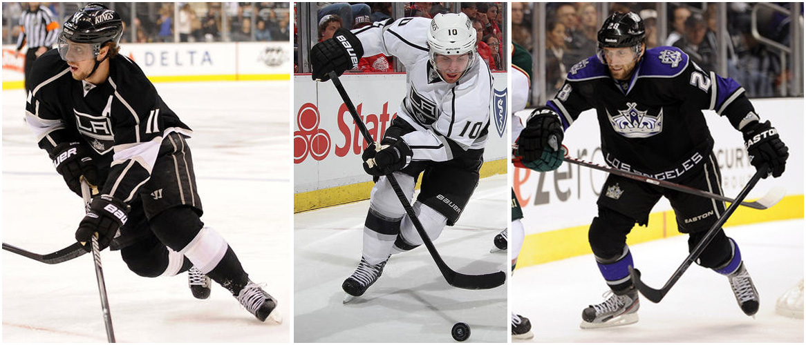
I don't know what it is about their primary jerseys, but I am a huge fan. I cannot even explain it. However, their alternates are just bad. On to the alternate jersey. I hate everything about it. I hate the chest logo. I hate the use of purple. I hate the Los Angeles on the midsection. I just hate it.
14. Vancouver Canucks
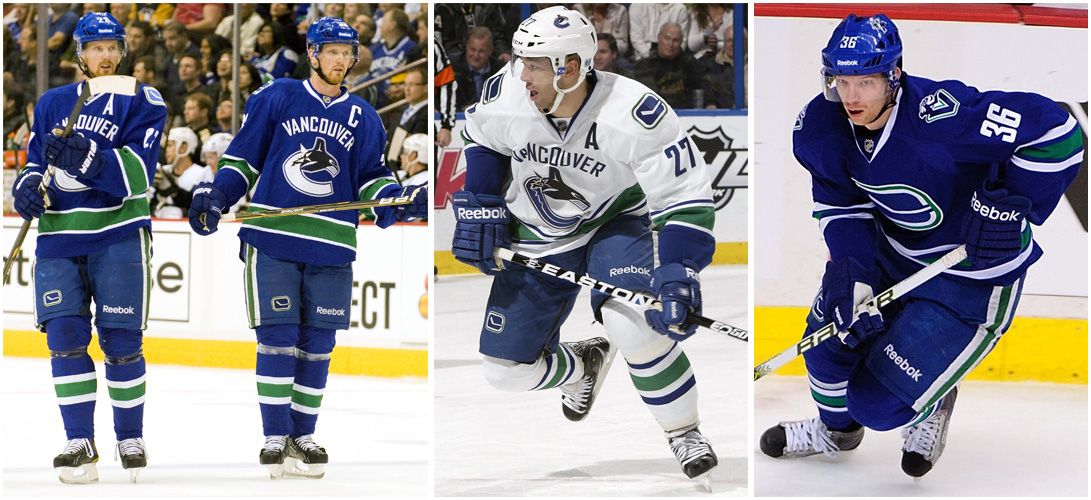
It's getting to the point where I have to get picky. I like a lot of this jersey, but love nothing on it. The weird Orca/C logo is just weird to me. I like the other logo better, but don't love it.
13. San Jose Sharks
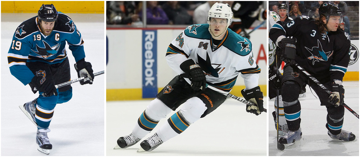
When I was a kid, I loved the Sharks jerseys. I loved the use of teal and black and the cool shark biting the stick. But then I grew up. Time to grow up Sharks.
12. Philadelphia Flyers
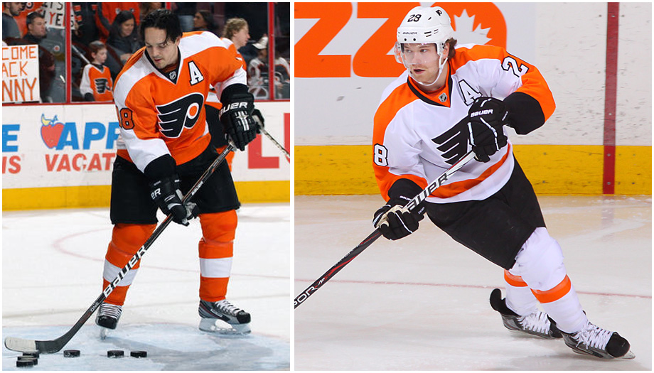
****BIAS ALERT*** I can't even talk much about these. I hate the color orange, but most people think these are one of the best. I hate these cheaters too much to allow them any higher up my list. If you have a problem with this, feel free to punch yourself in the face.
11. Tampa Bay Lightning
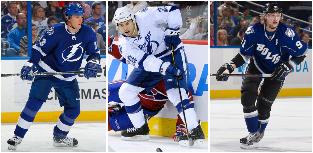
Another example of how I'm starting to get picky. The logo is not bad, but it's not as good as some of the others. I love the white and blue jerseys though. So much potential with those. Not a fan of the "Bolts" jersey. If they didn't have that one, they could have come so close. Maybe next year Tampa!
10. Detroit Red Wings
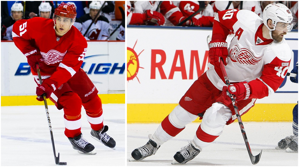
As much as I hate the Wings, I couldn't leave them out of the top ten. One of the classics. But, I couldn't let them be any higher. Seems to me they resemble something else I hate:
 9. Calgary Flames
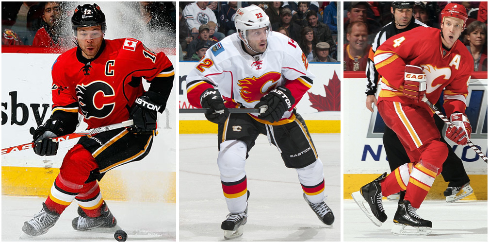
Seriously, having to nitpick a lot now. The logo is a little weird, but I still like it. Biggest criticism is that the alternate jersey is not their primary one. Love that jersey. Their best choice would be to drop the primary red jersey completely and make the alternate their primary.
8. Buffalo Sabres
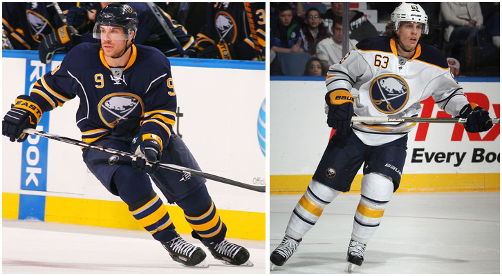
Their logo used to be so bad, but they fixed that problem. I'm a big fan of most things with these jerseys. They hit on almost every level, especially with the use of a buffalo. Get rid of some of the piping and we are talking top 5 potential!
7. Chicago Blackhawks
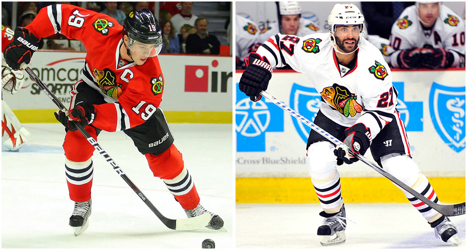
Classic jersey with little to complain about. love the use of the black in these jerseys. Too many teams with black in their arsenal try to overuse it when it is isn't necessary. Only thing I don't like is their logo. I know it's traditional, and I give it props for that, but too many colors are in it. I understand why they are there, but I have never liked it.
6. New Jersey Devils
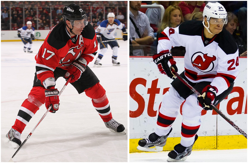
Simple, but they just work. Seems that red, white, and black just work well with hockey jerseys. I gave them the edge over the Blackhawks simply because their logo is simpler. Just a little on the cartoony side, but simple. I like simplicity.
5. Boston Bruins
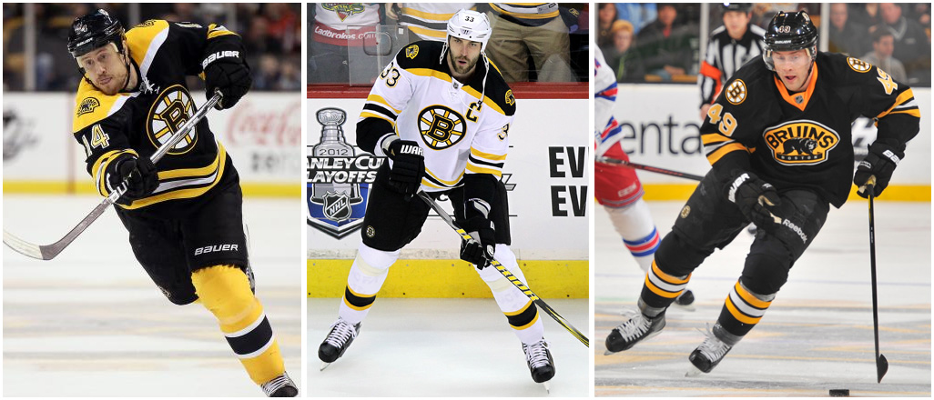
Probably the most difficult ranking in the whole league. Their primary jerseys are almost perfect. They are classic in every way. So what is holding them back? That alternate jersey logo is just weird. I don't hate it, it just has a awkward feel about it.
4. Toronto Maple Leafs
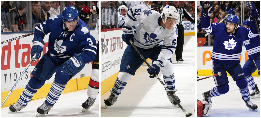
So simple, except the socks. Why would they put all those stripes on there? It confuses a simple jersey so much. I guess you cannot ask that much of Canada, eh?
3. Pittsburgh Penguins
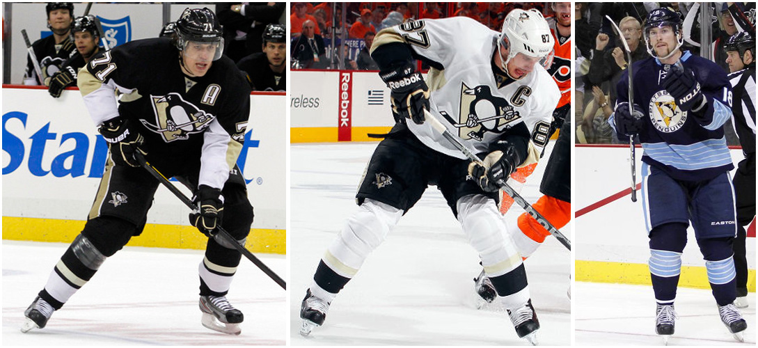
I know any of you that know me expected me to put the Pens at number one. I wanted to, I really did, but I couldn't do it. I tried to take some bias out of it. Out of all the non-original teams, this logo is the best. I'm also a sucker for those blue alternates.
2. Montreal Canadiens
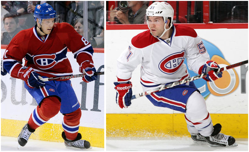
One of the most classic looks in any sport. I have no complaints about this jersey, except that they're from Canada.
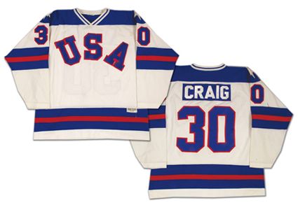
1. New York Rangers
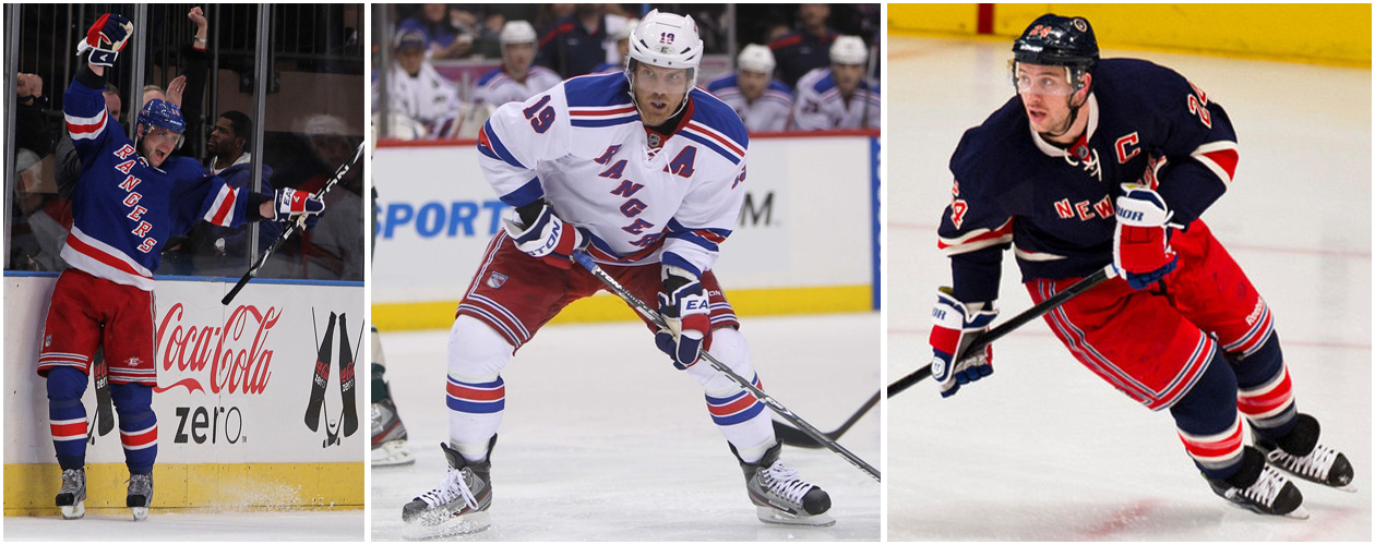
Very close to the Canadiens jerseys, but just a little better. Love the diagonal writing. Love the red, white, and blue. Just the best uniforms in the NHL. As close as the NHL gets to having my favorite jersey of all time:
Well that's my list. Feel free to offer up your thoughts on where I went wrong. Again, this is my personal ranking.